lootbox
UI/UX
brief
design, build and test a web application that facilitates the re use, recycling or re-purpose of scrap materials generated within the SCAD Savannah campus.
methodology
applying human centered design and human computer interaction to design a great service, inspired in Dan Saffer's 'Microinteractions'.
project details
- 4 weeks
- SCAD team project
empathizing
we started our research using a design thinking framework to empathize with the students. we mapped what students where 'doing', 'saying', 'thinking' and 'observing' (seeing).
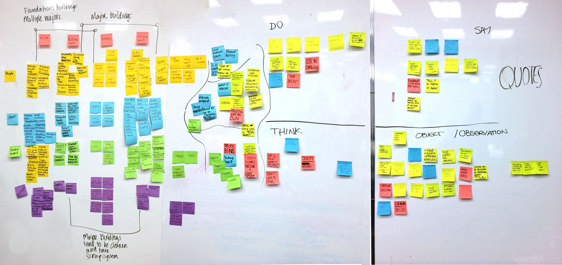
key insights + observations
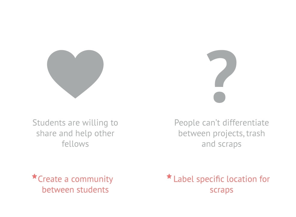

persona


ideation

how might we leverage the student community and connect them to share resources at SCAD?
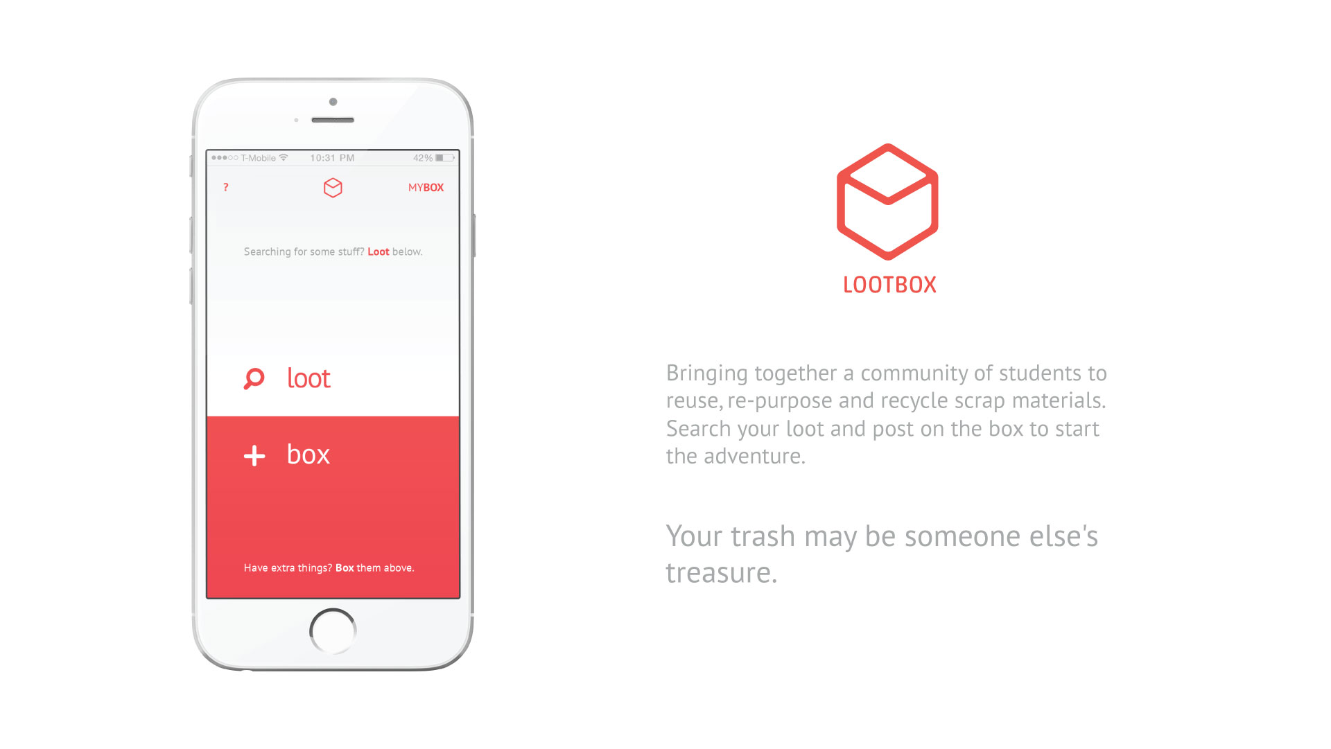
lootbox is a service to connect students who want to offer or search for scrap materials.
Looters
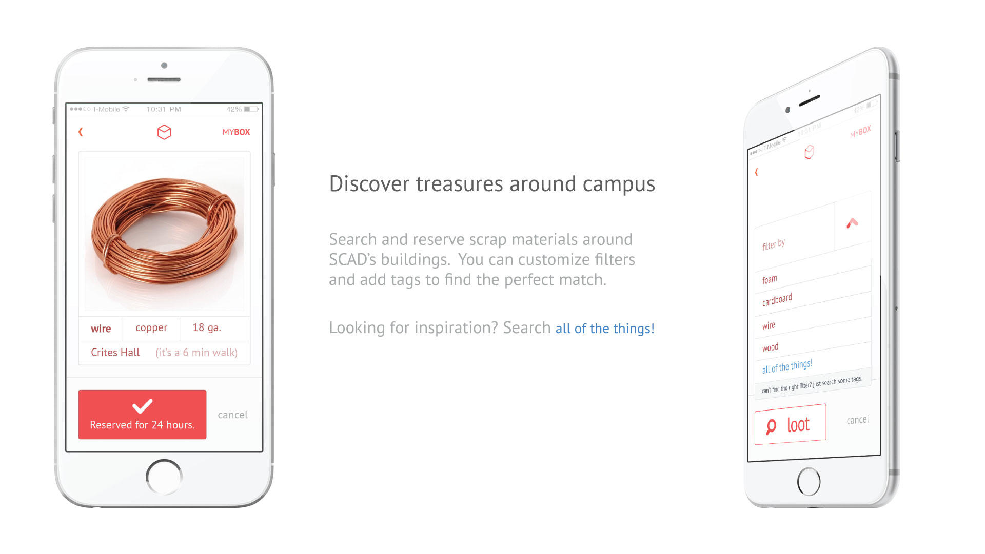
- search for a catalogue of scrap materials being posted
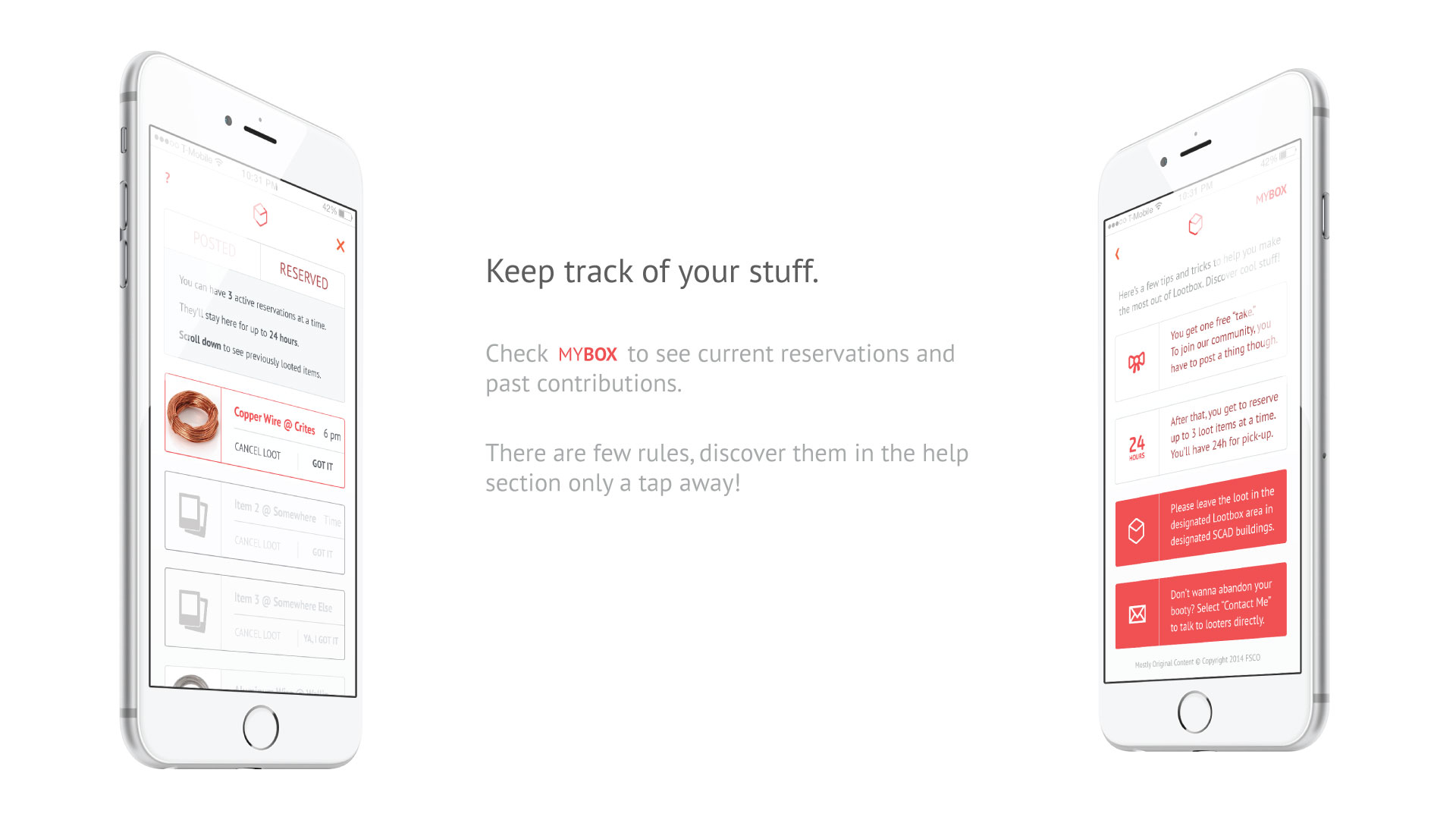
- able to reserve an item for 24 hours
- pick materials from a building box or contact the boxer
Boxers
- offerers can snap a photo, tag and add the location of the material they want to offer
- they should drop the material in a building 'box' or meet with the looter
system map

information architecture

service encounter map
this tool helped us map every touch point in a high level of the journey Cristina went through to use out service. it also helped us realize that some of these touch points were pain points, like meeting with the owner of the material she needed and possibly transporting the material if it was big or heavy.

prototyping
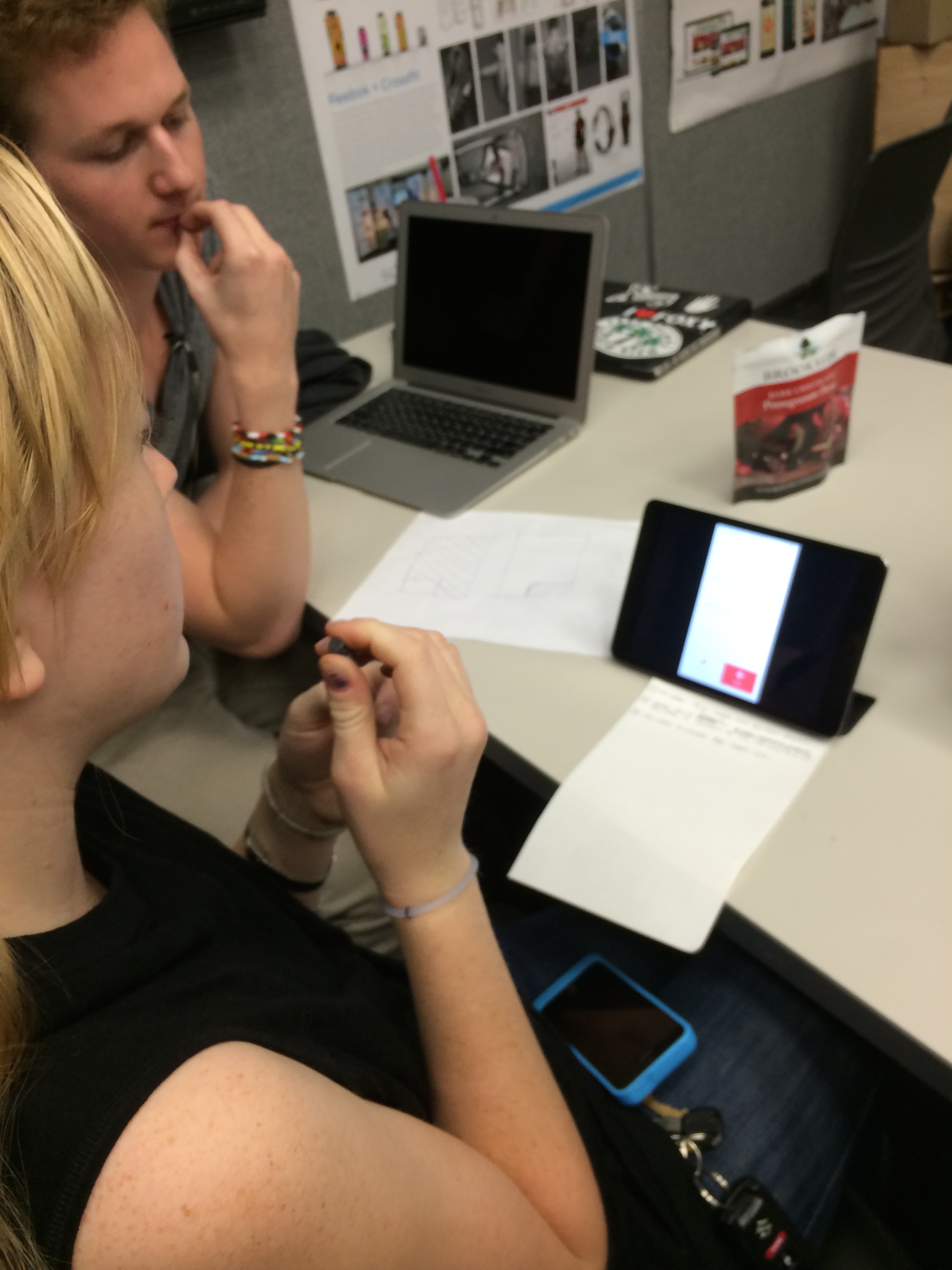
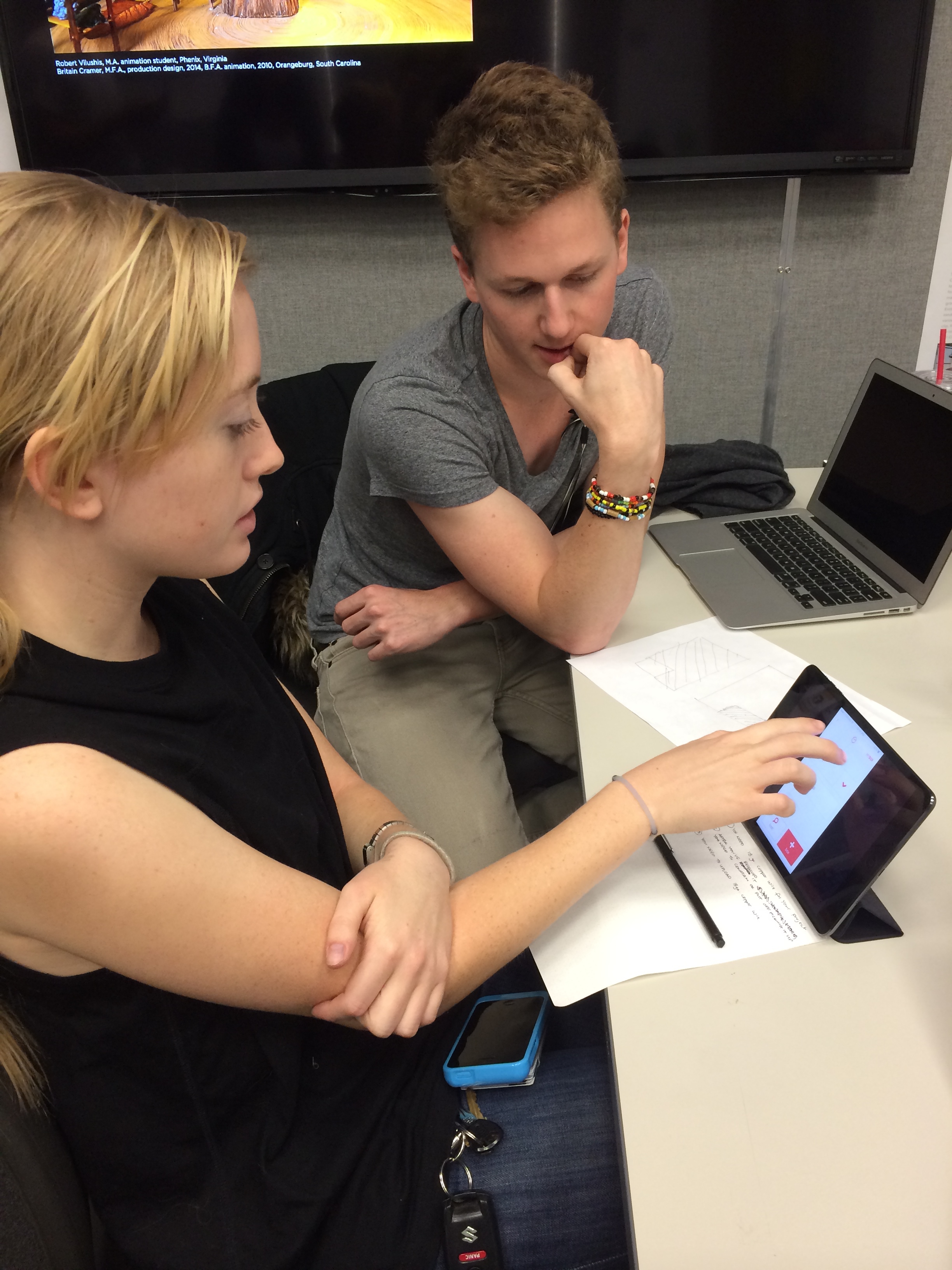
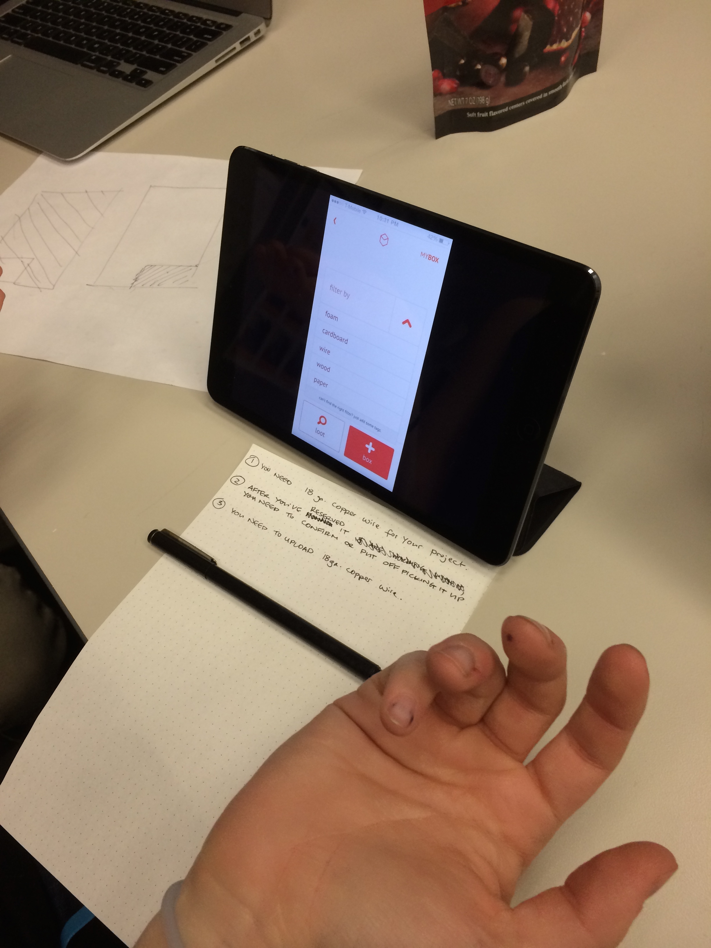
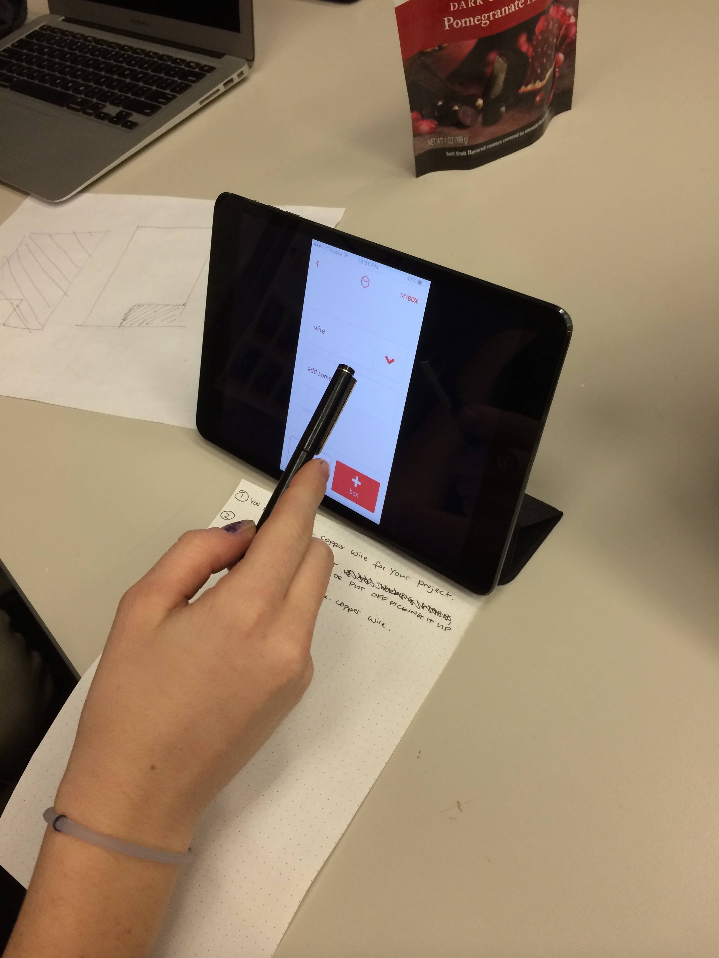
based on our initial Information Architecture diagram we sketched our app’s screens and wireframed the concept. a lo-fi version was done with pen and pencil, a mid-fi version was done with Fluid.ui, which were both user-tested since the beginning. the hi-fi screens were developed with illustrator. keynote was used to create a working prototype, a great way to give a realistic feeling to our testers in usability and heuristic testing.
low-fi

mid-fi

hi-fi prototype


heuristic testing
Fellow designers and classmates evaluated our work using Jakob Nielsen’s 10 Heuristics for User Interface Design.
Rules broken:
- No. 2 match between system and the real world
- No.10 help and documentation

Other usability testing findings
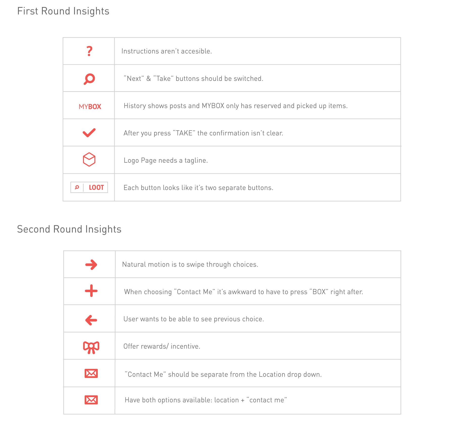
a fun failure
even though we received great feedback, there was a clear value to share materials between students and the app looked slick, the service wouldn't have worked out the way we designed it. we realized people needed an incentive for 'boxer' students, donors, to dedicate time and meet with the 'looters'. most students thought that using the app was 'too much effort' and they would just look into the box with materials.
however, cleaning up the rules and tweaking a bit the initial idea could have made an amazing service to connect students and establish a co-creation of value.

